- 01 - Histograms and scatterplots
- 03 - Quiz What would it look like
- 04 - Histogram of daily returns
- 05 - How to plot a histogram
- 06 - Computing histogram statistics
- 07 - quiz: Compare two histograms
- 8 - Plot two histograms together
- 9 - Scatterplots
- 10 - Fitting a line to data points
- 11 - Slope does not equal correlation
- 12 - Quiz: Correlation vs slope
- 13 - Scatterplots in python
- 14 - Real world use of kurtosis
01 - Histograms and scatterplots

- One of the most informative ways to consider daily returns is when we compare the returns of one stock with another.
Time: 00:00:19
02 - A closer look at daily returns
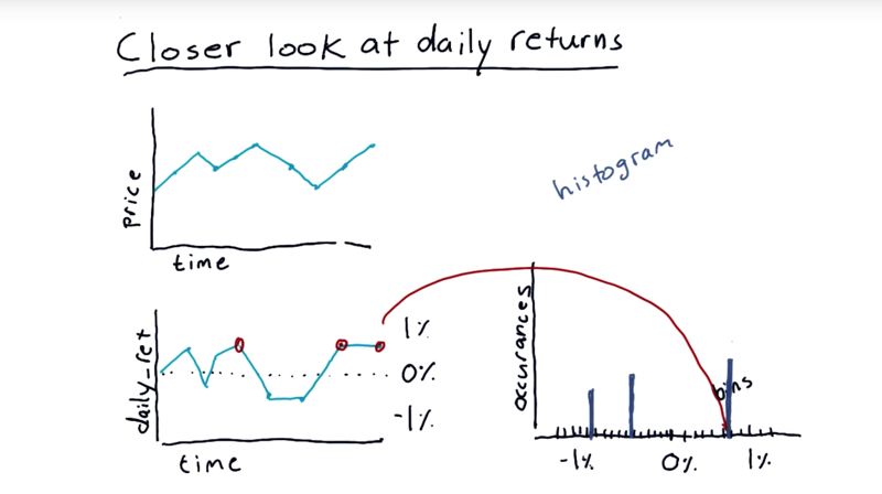
- starting with a price time series.
- we build daily returns, this daily return data is not too revealing as time-series.
histograms
- A histogram is a kind of bar chart where we plot the number of occurrences of each item versus the value.
- split up the range of data into lots of little bins.
- and count up how many times the data matches the range across that bin.
- a bar of the appropriate height in the histogram that represents how many times the data matched that value.
Time: 00:02:12
03 - Quiz What would it look like
What the histogram of S&P 500 daily return over many years look like?
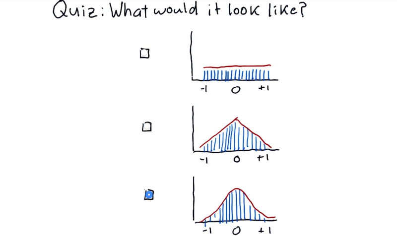
The correct answer: bell curve.
Time: 00:00:16
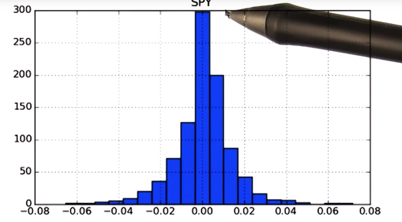
04 - Histogram of daily returns
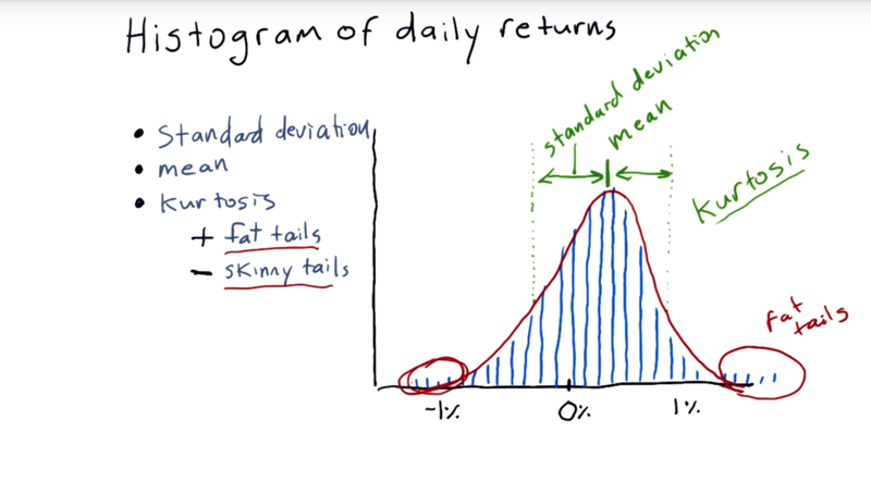
Statistics we can run on it to characterize histograms.
- mean.
- standard deviation: how far do individual measurements deviate from the mean.
- Kurtosis (means curved or arching): it tells us about the tails of the distribution.
The measure of kurtosis tells us how much different our histogram from that traditional Gaussian distribution.
- Positive Kurtosiswe indicate fat tails, Meaning that there are more occurrences out in these tails than would be expected if it were a normal distribution.
- Negative kurtosis indicates skinnytails, meaning that there are many fewer occurrences than would be expected if it were a normal distribution on the tails.
Time: 00:02:25
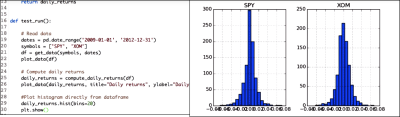
05 - How to plot a histogram
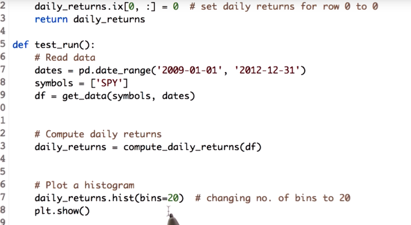
daily_returns.hist(bin=20) will plot daily_return as histogram with 20 bins. the default bin parameter is 10.
Time: 00:02:03
06 - Computing histogram statistics
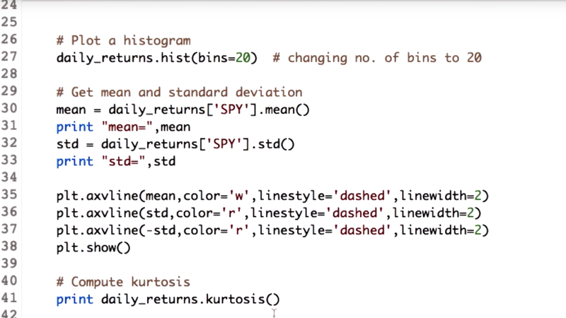 Calculate mea and deviation and kurtosis:
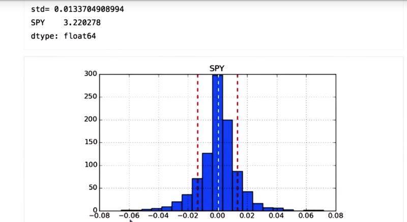
mean = daily_returns['SPY'].mean()
std = daily_returns['SPY'].std()
kurtosis = daily_returns.kurtosis()
Plot mean and diviation using axvline() in the Matplotlib library .
plt.axvline(mean, color='w', linestyle='dashed', linewidth=2)
plt.axvline(std, color='r', linestyle='dashed', linewidth=2)
plt.axvline(-std, color='r', linestyle='dashed', linewidth=2)
plt.show()
-
positive kurtosis for the SPY stock, which means we have fat tails.
-
Note:
bincounts()usingnumpy.histogramfunction.
Time: 00:02:11
07 - quiz: Compare two histograms
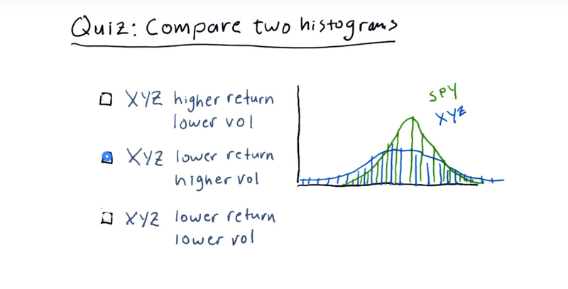
Quiz: Select the option that best describes the relationship between XYZ and SPY.
Note:
- These are histograms of daily return values, i.e. X-axis is +/- change (%), and Y-axis is the number of occurrences.
- We are considering two general properties indicated by the histogram for each stock: return and volatility (or risk).
correct answer: XYZ has a lower return and higher volatility than SPY.
- mean of XYZ, is lower than the mean of SPY.
- XYZ got a larger standard deviation (broader shoulders), therefore, higher volatility.
8 - Plot two histograms together
Since the daily_returns data frame has data for two stocks, daily_returns.hist(bin=20) will plot the data in two subplots.
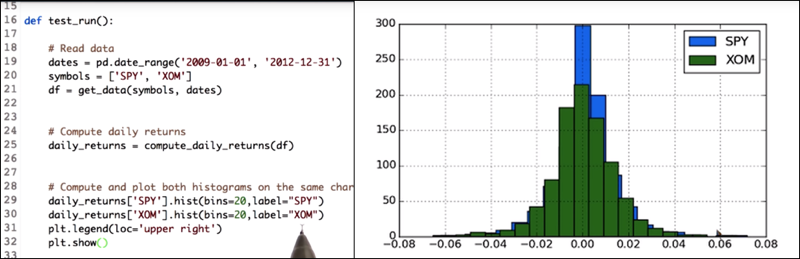
daily_returns['SPY'].hist(bin=20,label="SPY")
daily_returns['XOM'].hist(bin=20,label="XOM")
...
- To get two histograms on the same x and y axis, call the histogram functions separately on each of the stocks daily return values.
- also add the label parameter so that we can differentiate between the histogram of the SPY and XOM.
Time: 00:01:31
9 - Scatterplots
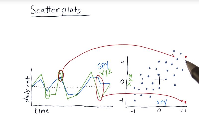
A scatterplot is another way to visualize the differences between daily returns of individual stocks. The left graph is daily return of two stocks. S&P 500 and XYZ.
- On a scatterplot, there are a number of individual points or dots represents the daily returns of two stocks that happened on a particular day.
- the dots are somewhat scattered. They don’t form a perfect line.
Time: 00:02:02
10 - Fitting a line to data points
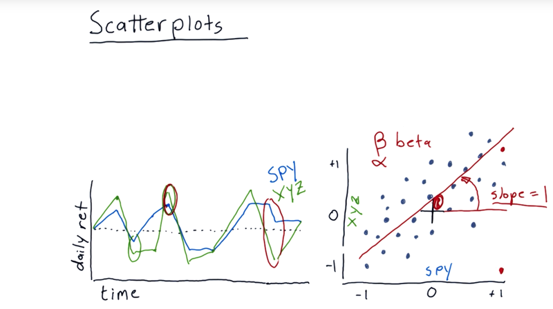
- we can fit a line to it using linear regression.
- slope, in financial terminology, is usually referred to as beta which means is how reactive is the stock to the market.
- e.g. Beta = 1 then on average, when the market goes up 1%, that particular stock also goes up 1%.
- if beta = 2, then if the market were to go up 1%, we’d expect on average for that stock to go up 2%.
- intercepts, also called alpha. Positive alpha means that this stock is actually on average performing a little bit better than the S&P 500 every day. If it’s negative, it means on average it’s returning a little bit less than the market overall.
Time: 00:01:53
11 - Slope does not equal correlation
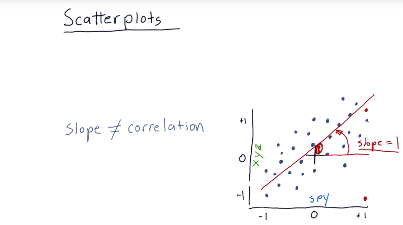
- The slope is no correlation.
- Correlation is a measure of how tightly do these individual points fit that line. the range of correlation is from 0 to 1.
Time: 00:01:15
12 - Quiz: Correlation vs slope
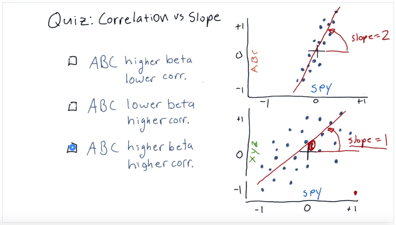
Select the option that best compares ABC against XYZ, in terms of beta (slope of linear fit) and correlation with the market (represented by SPY).
13 - Scatterplots in python
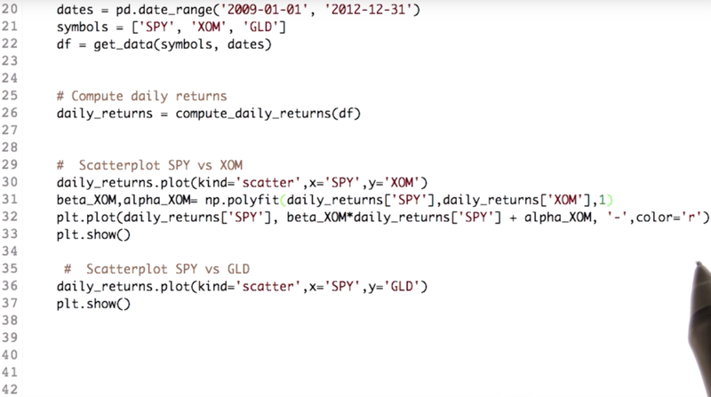 Key codes
daily_returns.plot(kind='scattr',x='SPY', y='XOM') # scatterplot
beta_XOM,alpha_XOM=np.polyfit(daily_returns['SPY'],daily_returns['XOM'], 1)
plt.plot(daily_returns['SPY'],beta_XOM*daily_returns['SPY'] + alpha_XOM, '-',color='r')
plt.show()
- Kind parameter of the plot function of the data frame will help us plot scatterplots.
- NumPy’s
ployfit()function can fit a line to scatterplots and get alpha and beta of the regression line. the parameter “1” means the fitting is linear, y = mx + b.Here m is the coefficient and b is the intercept.
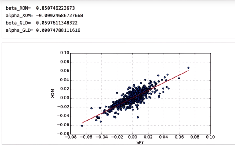
- beta values for the XOM is greater as compared to that of GLD so that XOM is more reactive to market as compared to GLD.
- the alpha values denote how well it performs with respect to SPY and Numbers indicate that GLD performed better.
One last thing is to find the correlation yet again.
daily_returns.corr(method='pearson') will output in the correlation matrix with the correlation of each column with each other column.
- high correlation means the dots fit the line closely.
Time: 00:04:45
14 - Real world use of kurtosis

- the distribution of daily returns for stocks and the market looks very similar to a Gaussian.
- but it is dangerous to assume that financial returns are normal distributions because it ignores kurtosis or the probability in the tails.
- In the early 2000s investment banks built bonds based on mortgages and assumed that the distribution of returns for these mortgages was normally distributed.
- Their model failed because of the assumption of normal distribution
Time: 00:01:06
Total Time: 00:24:11
2019-01-12 初稿